About Me
I've developed a broad skill set in my 10+ years as a data scientist. At the New York Times, I was a data visualization engineer, doing frontend work and building dashboards. At NYU, I got an MS in Data Science with heavy emphasis on machine learning and AI. Following that, at Facebook I learned how a top-tier tech company operates and leaned into product analysis - embedding with a product team, designing and moving metrics to help achieve team goals. I continued product work at Udemy, designing our customer onboarding funnel, producing a company-wide learning engagement KPI, leading the Experiment Review Council and upgrading our experimentation system. Most recently at Coursera, I worked with marketing teams, developing an LTV model and building out data pipelines to power email campaigns.
Projects
Machine Learning
Bookworm

Bookworm is a chatbot that answers questions based on a given body of text. It augments user prompts with relevant passages from the text so that responses from GPT-3 are more trustworthy and include citations. This demo uses the Bible as source text.
Classification Using Neural Networks
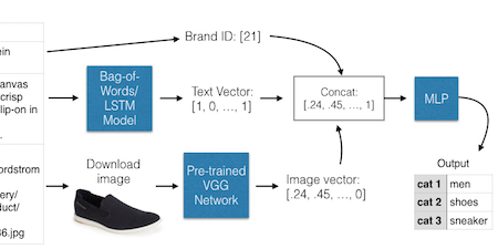
With Lucy Wang and advisors Kelvin Xu and Kyunghyun Cho: we used image recognition, natural language processing and neural networks to classify fashion products and accessories into three tiers of categories with very high (up to 99%) accuracy.
Generative Models for Particle Physics
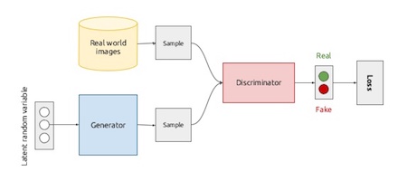
Two parts: image corresponds to part 1. With Alex Pine, Israel Malkin and advisor Kyle Cranmer. We experimented with more efficient methods for simulating International Linear Collider events. We simulated calorimeter readings using a conditional GAN (first paper), and then using a Wasserstein GAN (second paper).
Classifying Appeals Court Documents
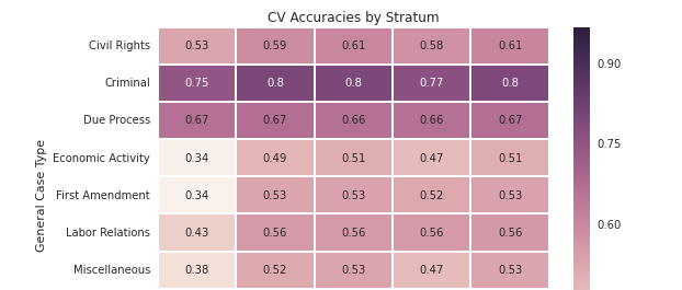
Full paper here. With Alex Pine and advisors Daniel Chen, David Rosenberg, and Kush Varshney: we used natural language processing and machine learning techniques to classify written appeals court decisions as liberal or conservative.
Donors Choose Prototype Report
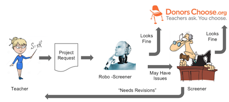
An exploratory analysis and prototype for automatically screening DonorsChoose.org projects using machine learning techniques. See also the presentation.
Individualized Student Reports
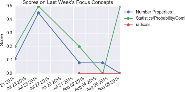
Individualized student progress reports for Yleana Leadership Academy, a nonprofit test prep camp. Reports were provided weekly to teachers so they knew what areas to focus on for each student, so they could provide individualized problem sets, and to group together students with similar needs.
Data Visualization
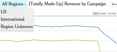
NYTimes Dashboards
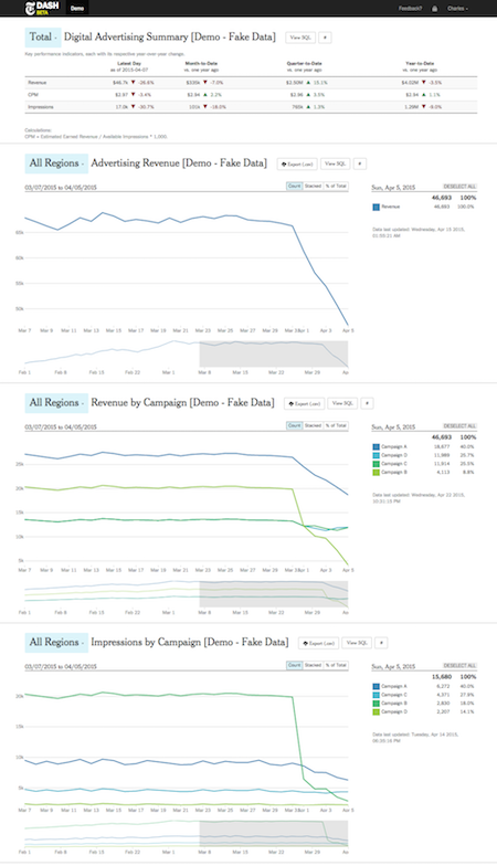
As a data visualization engineer for the New York Times, I worked with a team of 4-6 to develop an interactive visual dashboard for business intelligence analytics. By the time I left, we had built over 100 up-to-date charts for 18 teams throughout the company.
Soda Map
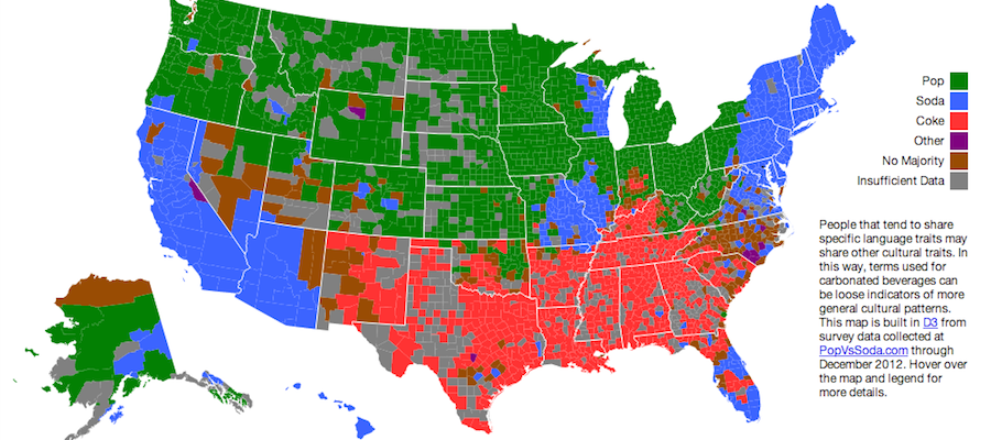
Pop, Soda or Coke? An interactive choropleth map demonstrating regional differences in what we call soft drinks.
World Cup 2014: Group G
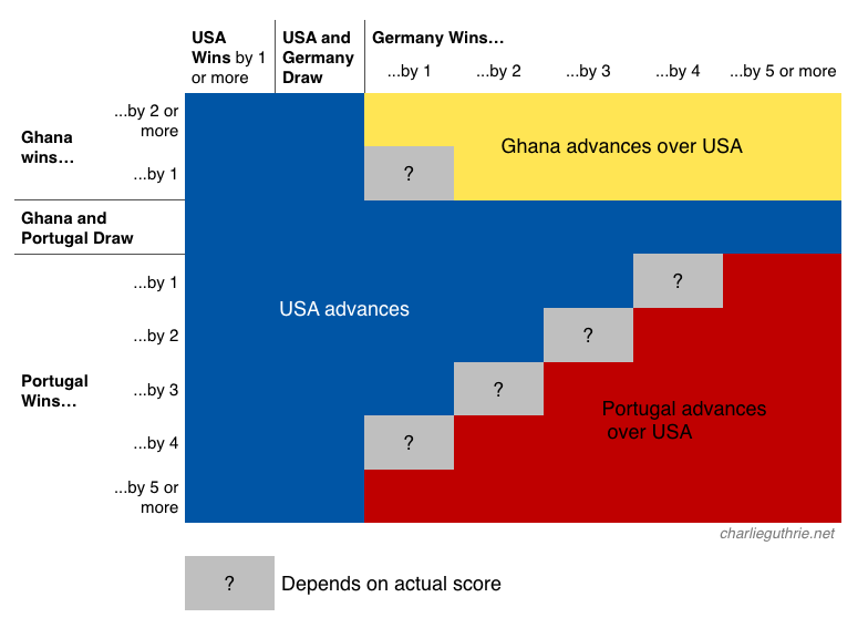
I was stressing out about whether team USA would make it out of Group G going into their game vs. Germany, so I made a chart. I posted it to a couple of social media sites and it generated 400,000 views in 24 hours.
City Hall
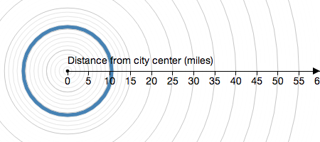
If American cities had the same geographic footprint, which would have the biggest population?
3D Parallax Effect

A simple example demonstrating how to achieve 3-D effects using parallax in D3
APDA Parkinson's Infographic
Infographic about Parkinson's disease made with Vicky Sarmiento for the American Parkinson's Disease Association
DC Action Project
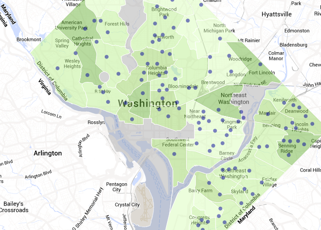
An interactive map of statistics displaying where resources and well-being vary in D.C. A volunteer collaboration with Nick McClellan et al through Datakind
Live-Updating Bar Chart

A bar chart that updates live, for displaying and ranking streaming data for The New York Times
Talks
Evaluating Online Course Materials
Northeastern Group on Education Affairs (NEGEA), on 2017-05-05: Evaluating the impact of course material engagement on assessment performance, on the MedU online course platform. (PDF, PPT). Published to journal Teaching and Learning in Medicine (abstract).
Democratizing Data
Innovation Enterprises Data Visualization Summit, San Jose, on 2015-04-28: A talk about making the NYTimes more data-driven by expanding access to internal data through simple visualization tools.
Auto-Screening for Donors Choose
NYU Introduction to Data Science, New York City, on 2015-12-17: An exploratory analysis and prototype for automatically screening DonorsChoose.org projects using machine learning techniques. See also the full report.
Dashboards with D3
NYC D3.js Meetup, New York City, 2014-04-28: Why and how to use D3 to make live-updating dashboards. See also interactive keynote version